


Introduction
Exploratory Data Analysis (EDA) is a crucial step in the data analysis process that involves investigating and summarizing the main characteristics of a dataset. The goal of EDA is to gain insights and understanding about the data, identify patterns, relationships, and anomalies, and form hypotheses that can be later tested. EDA is an iterative process and helps in identifying the most important variables and relationships in the data. It is a visual and descriptive approach to data analysis that involves using graphs, plots, and summary statistics.
EDA is performed before building predictive models and is important for making data-driven decisions. It helps in identifying the limitations and potential biases in the data and helps in making informed decisions about the next steps in the data analysis process.
There are 6 major steps involved in EDA :
Collecting the data
Finding all variables and interpreting them
Cleaning the data from the dataset
Finding the correlation between the variables in the dataset
Selecting and using the right statistical methods
Visualizing and Analyzing the results
Step 1: Importing the Required Libraries and Data
To perform EDA, we need to import the necessary libraries and the data. In our example, we will use the following libraries:
import pandas as pd
import matplotlib.pyplot as plt
import seaborn as sns
We will also use the wine quality dataset, which can be obtained from UCI Machine Learning Repository. This dataset contains information about various attributes of red and white wine samples.
# Importing the wine quality dataset
url = "https://archive.ics.uci.edu/ml/machine-learning-databases/wine-quality/winequality-red.csv"
df = pd.read_csv(url, sep=";")
Step 2: Understanding the Data
The first step in EDA is to understand the data, which involves exploring the structure and features of the data. We can do this by using the following commands:
# Shape of the data
print(df.shape)
# Head of the data
print(df.head())
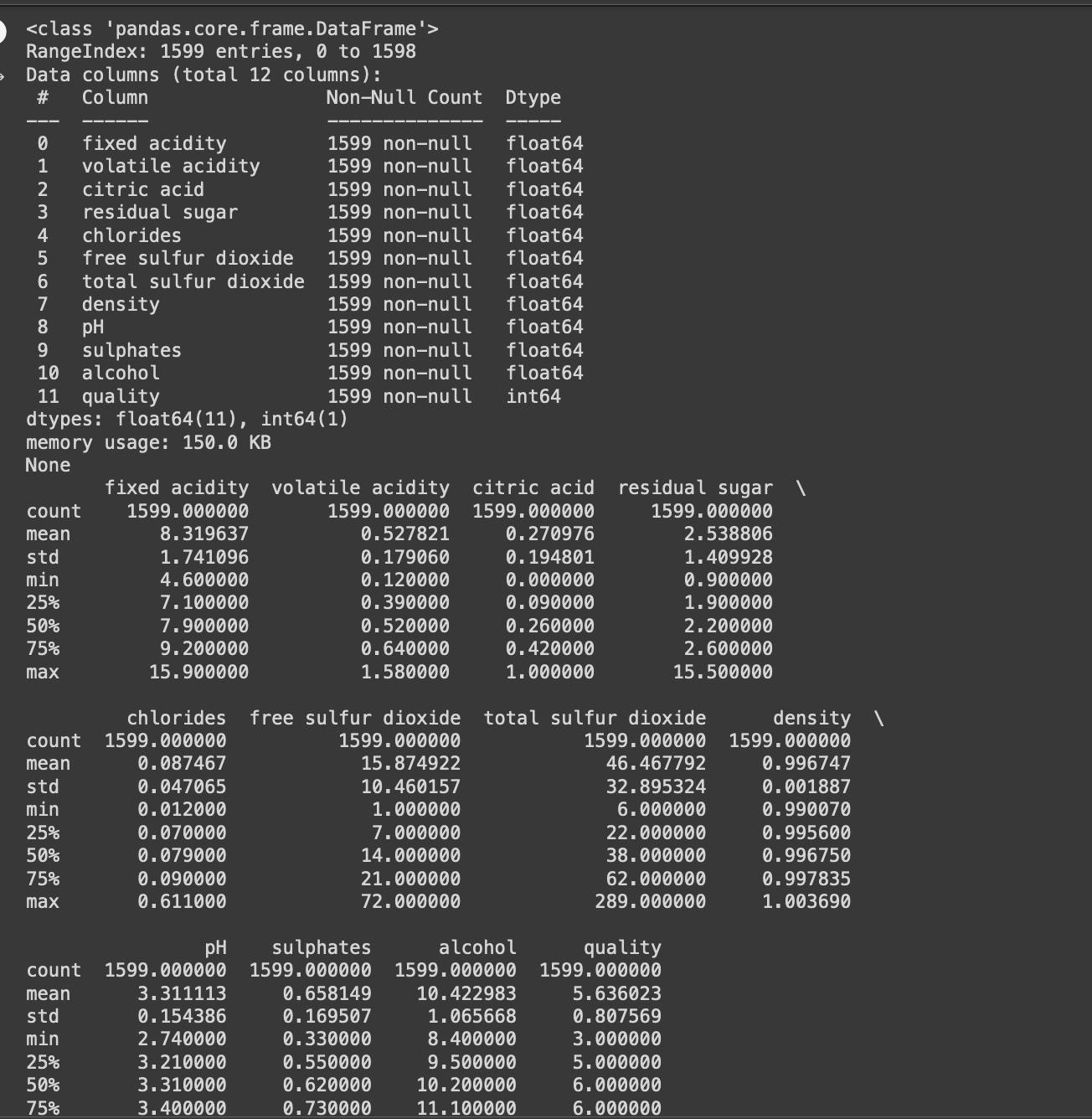
# Information about the data
print(df.info())
# Description of the data
print(df.describe())
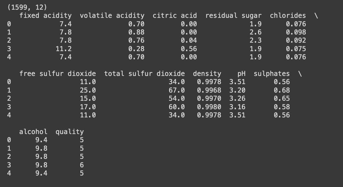
The 'shape' of the data gives us the number of rows and columns in the dataset.
The 'head' command returns the first few rows of the data.
The 'info' command provides information about the data, such as the number of non-null values, data types, and memory usage.
The 'describe' command returns the summary statistics of the numerical attributes in the data.
Step 3: Cleaning the Data
In this step, we clean the data by handling missing values, incorrect data types, and outliers. Cleaning the data is important to ensure that the results are accurate and meaningful.
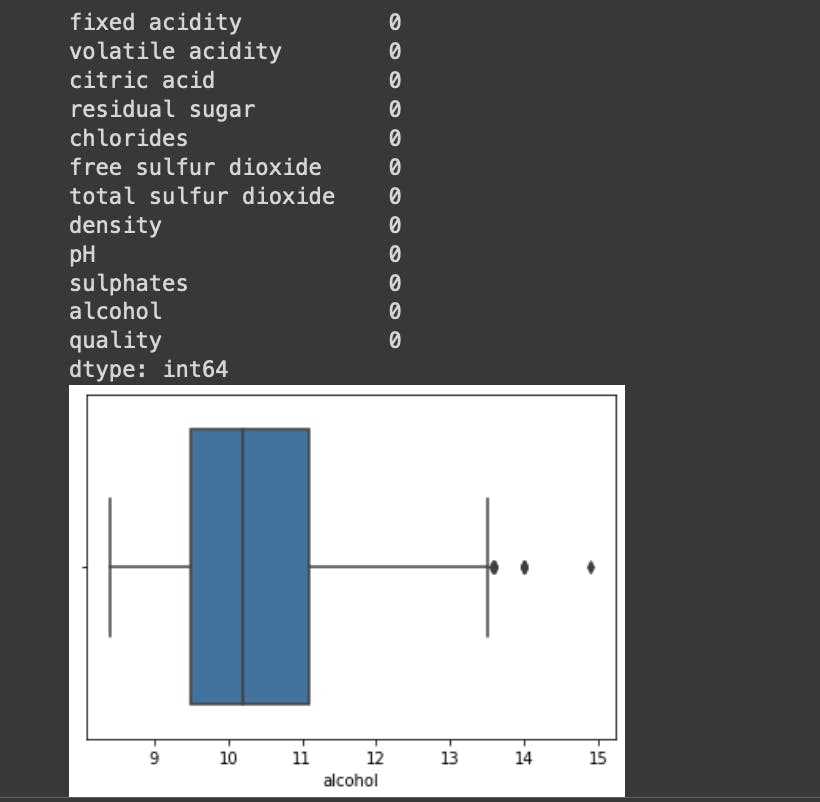
# Checking for missing values
print(df.isnull().sum())

# Handling missing values
df = df.dropna()

# Checking for outliers
sns.boxplot(x=df["alcohol"])

# Handling outliers
q1 = df["alcohol"].quantile(0.25)
q3 = df["alcohol"].quantile(0.75)
iqr = q3 - q1
lower_bound = q1 -(1.5 * iqr)
upper_bound = q3 +(1.5 * iqr)
df = df[(df["alcohol"] > lower_bound) & (df["alcohol"] < upper_bound)]
Step 4: Visualizing the Data
A visualization is a powerful tool in EDA that helps in understanding the patterns and relationships in the data. We will use several plots to visualize the data, such as histograms, scatter plots, and bar plots.
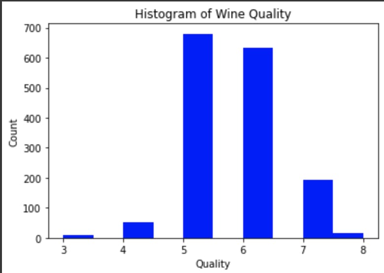
# Histogram of wine quality
plt.hist(df["quality"], bins=10, color="blue")
plt.xlabel("Quality")
plt.ylabel("Count")
plt.title("Histogram of Wine Quality")
plt.show()
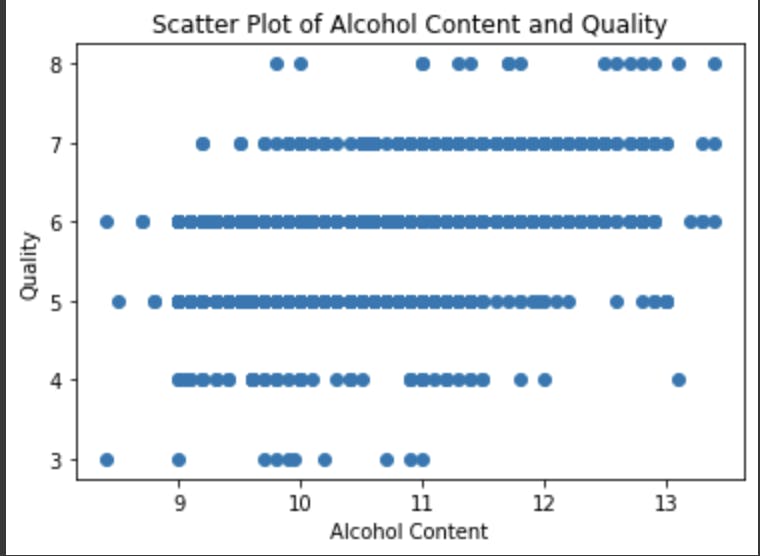
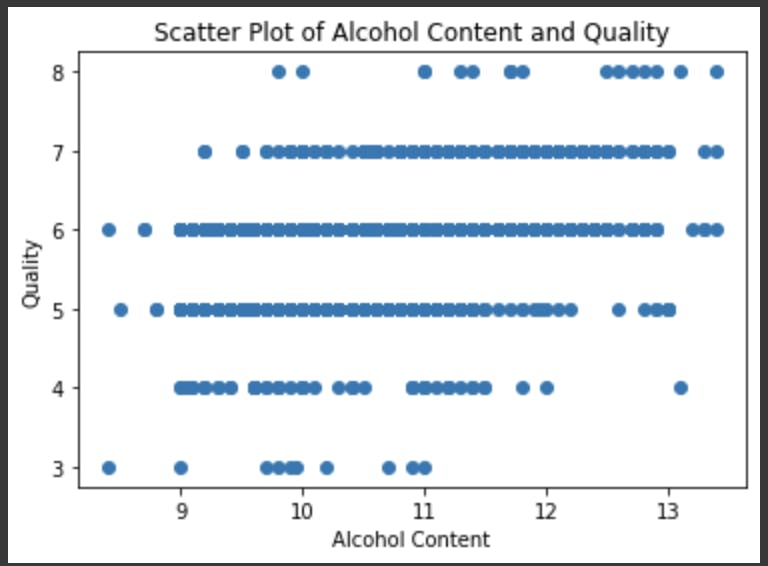
# Scatter plot of alcohol and quality
plt.scatter(df["alcohol"], df["quality"])
plt.xlabel("Alcohol Content")
plt.ylabel("Quality")
plt.title("Scatter Plot of Alcohol Content and Quality")
plt.show()
# Bar plot of wine type and quality
sns.barplot(x="type", y="quality", data=df)
plt.xlabel("Wine Type")
plt.ylabel("Quality")
plt.title("Bar Plot of Wine Type and Quality")
plt.show()
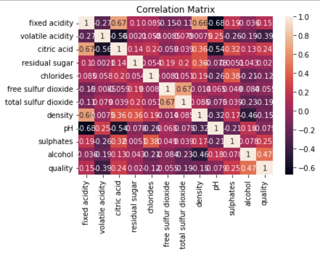
Step 5: Correlation Analysis
In this step, we will perform a correlation analysis to understand the relationships between the attributes in the data.
# Correlation matrix
corr = df.corr()
sns.heatmap(corr, annot=True)
plt.title("Correlation Matrix")
plt.show()
Step 6: Conclusion
In this article, we have learned about Exploratory Data Analysis (EDA) in Python, step by step, using an example of wine data analysis. We have covered the steps involved in EDA, from importing the data to visualization, and correlation analysis. By using these steps, we can gain insights and understanding about the data, which is crucial for making data-driven decisions.
In our example, we have learned that the alcohol content of wine is positively correlated with its quality, and red wine tends to have a higher quality compared to white wine. These insights can be useful for wine-makers and marketers in making data-driven decisions.
In conclusion, Exploratory Data Analysis is a crucial step in the data analysis process and is essential for gaining insights and understanding about the data.
Thanks for reading! ❤️